Global Connect Marketplace
Buy. Sell. Earn.

Global Connect Marketplace (GCM) is a leading Agency Distribution Network in Asia. The vision is to enhance customer’s lives by delivering products and services of the highest integrity and quality. Ultimately, building meaningful and sustainable relationships with customers that will shape a culture of entrepreneurship and empowerment.
- App UI Design
- Visual Systems
Brief
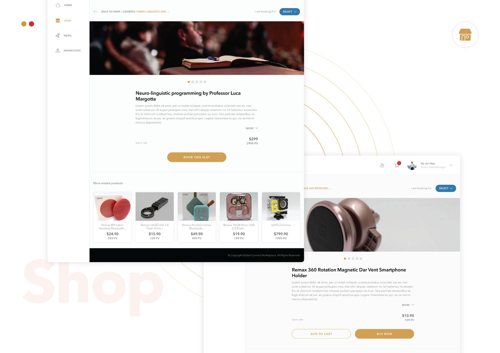
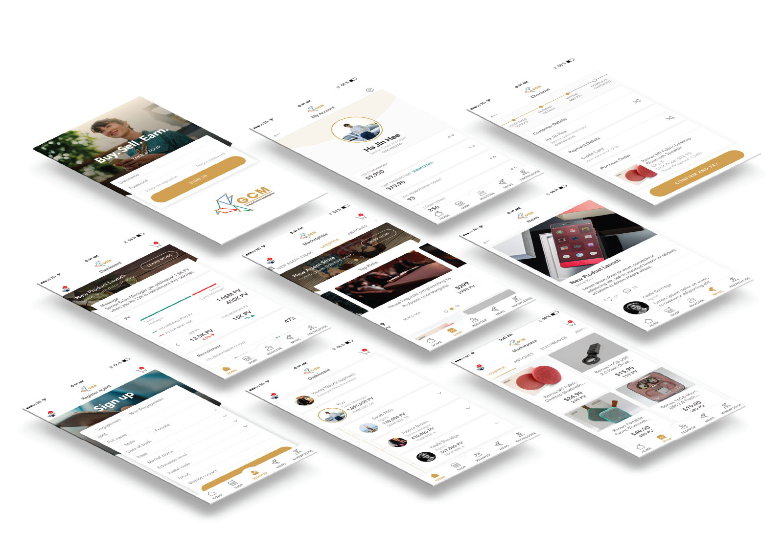
GCM engaged me to design their mobile app and website UI as they already had a brand mark created. The App has 5 specific areas to focus on – Dashboard, Shop, Onboarding, Knowledge, and Forum.
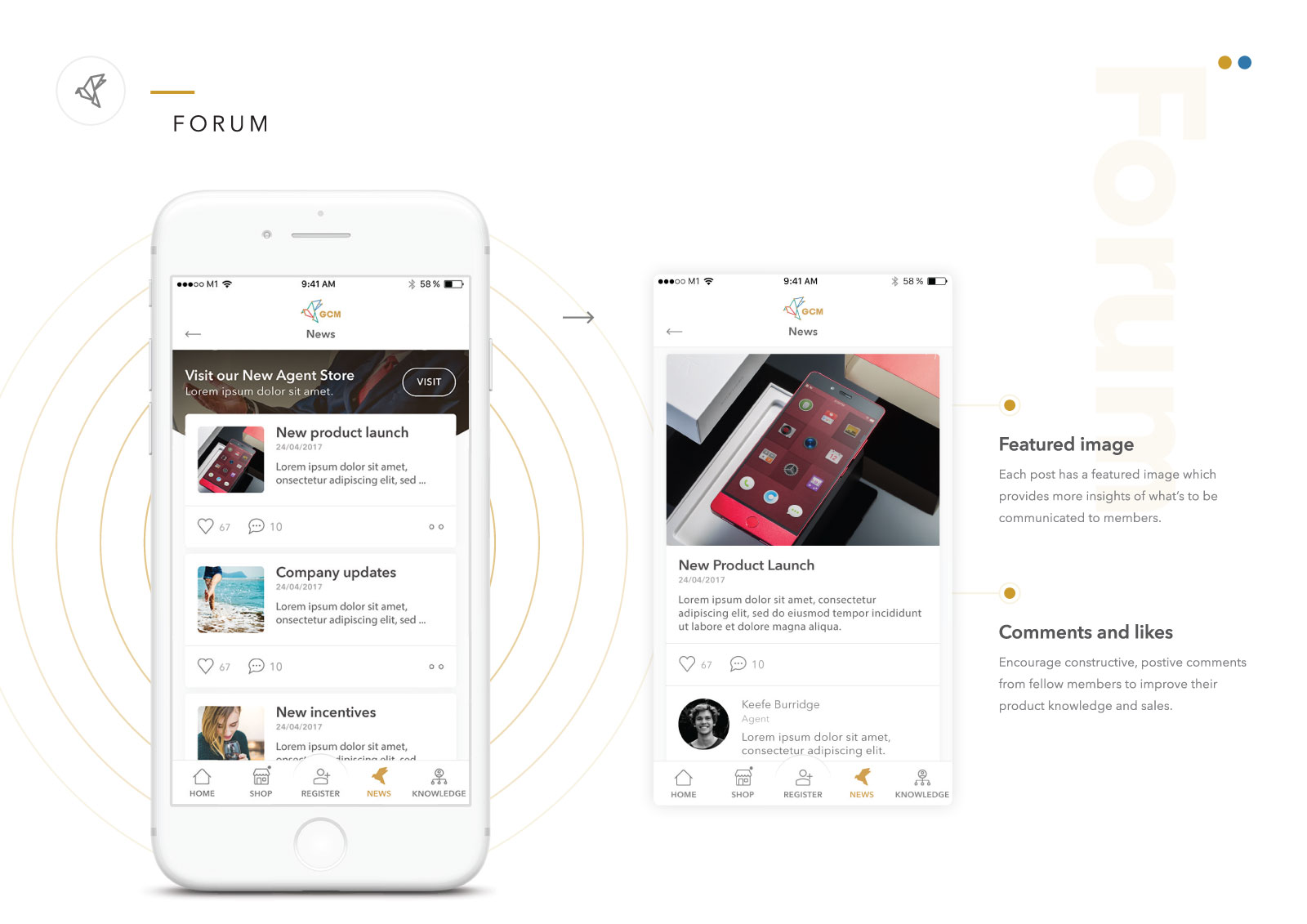
Members are automatically enrolled in the points system where the dashboard provides an overview of their network performance through the e-commerce platform. When they build on their network, their income also grows. On top of that, the knowledge base is all the members need to equip themselves should they have any questions with regards to their sales process, recruitment, etc. Updates and news are also broadcast through the forum regularly.

Challenge
With a broad scope of work against limited time, we had to focus on the priorities. As we are already on the high fidelity stage, we need to get the style and colours aligned to the brand. However, the brand guide wasn’t finalised. I worked in parallel with the team getting the brand style and colours right.

Solution
With the 2 core business objectives in mind – To increase engagement in e-commerce transactions and, To increase more on-boarding agents/members. We have to rethink the interaction design to make it more intuitive and effortless for the users.
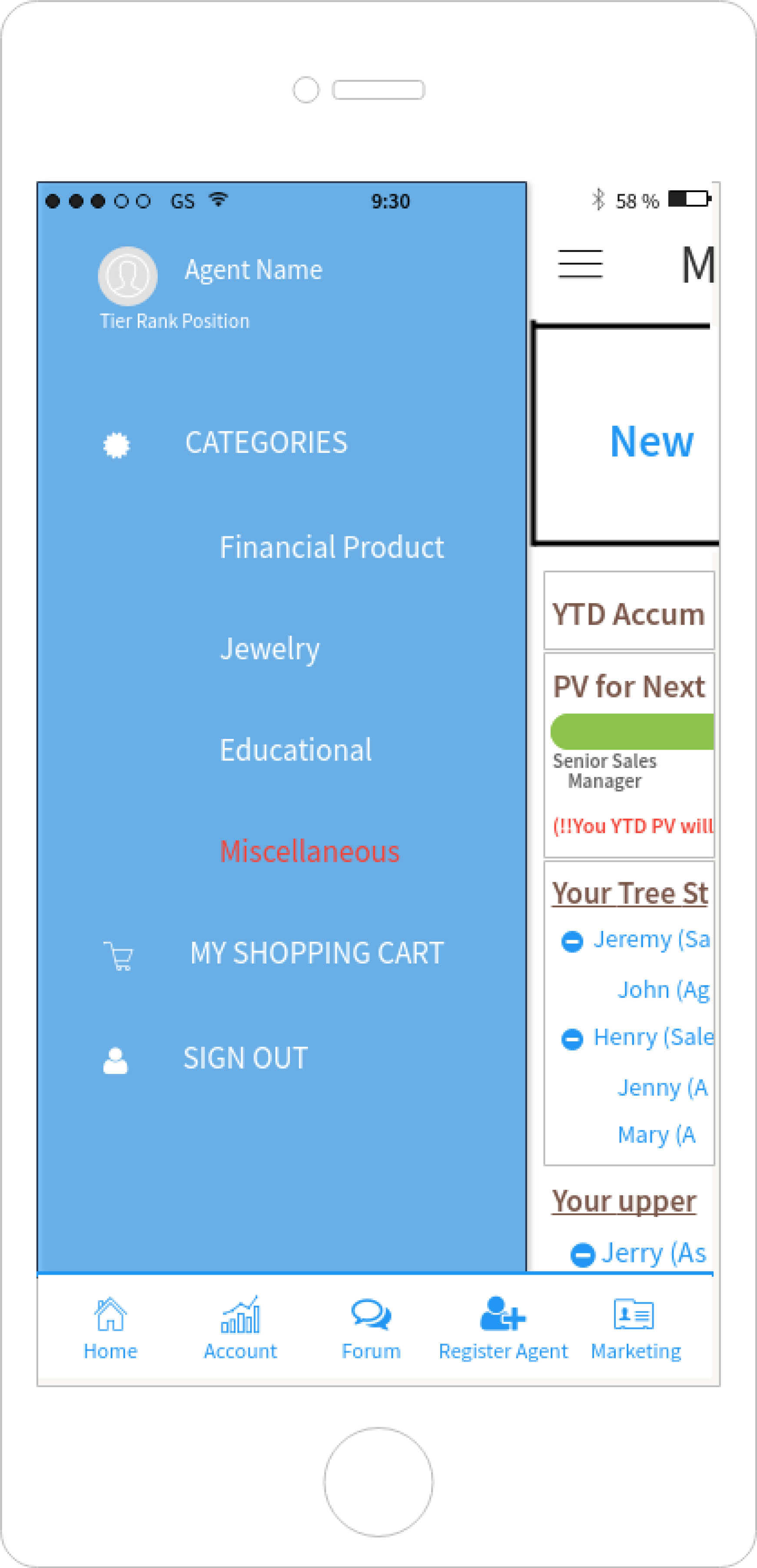
Instead of hiding the products and categories in the hamburger menu, we want users to have faster access to the shopping list and make a transaction. Therefore, I’ve replaced the 2nd icon (previously ‘account icon’ from their proposed wires) on the tab bar with the ‘shopping category’ icon. The center icon in the tab bar is also more emphasised, which fulfills the increased engagement in e-commerce transactions objective. These 2 icons take up the primary position of the navigational strategy.
The account icon is now grouped together with user settings icon. This makes more sense as they contain every piece of information about the user.
The dashboard also has the potential to implement more appealing graphs to create more meaningful data to the users. Users should be able to view their PV in a day, week, month, year. The app can also help them see where they stand in terms of recruitment sales and product sales.
Global Connect Marketplace - Mobile App UI Design







Global Connect Marketplace - Mobile App UI Design


